30 April 2010

Alter an Alphabet Letter for a New Look!

Hey!

Ever think you may not have exactly what you want in your stash?  Well - maybe you do but you don't realize it!
I will show you how to 'alter' a pre-finished Alphabet Letter - watch as it goes from plain fuzzy yellow to crazy, treasure glitter!

OK - this morning while having coffee, I looked around to see what I want to work on in my craft studio.....when I spot this book, a project that is a work-in-progress. You may have seen my earlier post when I altered a children's book into this.....here is the cover:


It's covered with new paper, but its bare - it needs embellishing!
I figured a good place to start was to add an alphabet chipboard letter as my beginning point - and later I can progress from there. 
But a quick look tells me that I do not have any letters slightly resembling my book!
Time to do some altering!!!

I go to my supply cupboard and bring out my chipboard alphabet box, some glitter and gems.
See the yellow and blue chipboard alphabet letters in the baggies - yup, I am going to alter one of those!


Oh - a quick note - its best if you have 2 sizes of glitter as the finer glitter will "fill in" the gaps left by the larger glitter. Don't forget your glittering tray!  Alright!


Now let's roll!


GLITTER UP! 
First cover your chipboard [or even paper] with a liguid glue and sprinkle liberally with the largest glitter. Press and tap off the excess ...
Now, switch to the finer glitter, and shake it all over your letter. 
Gently shake your letter to allow the glitter to fall into the cracks, and see if the edges are coated.
 You can always come back when everything is dry, add glue to bare spots, and repeat. 

ADD MORE PIZAZZ WITH GEMS
Now its time to add more depth, and interest to your letter. I am doing this with gems. 
So I use a pointed object like a push pin, and scrap away an area that is slightly smaller than the gem I wish to add, and add a small dab of glue, then push my gem into the spot and press it down.

This should allow your gem to snuggle in the surrounding glitter. A lot of the time, my glue squished up and out the sides of the gem - so I sprinkled more fine glitter over it - voila!

Repeat, adding gems till you are satisfied with your design. 


Its hard to photo the larger clear opalescent gems I've used, or the smaller coloured ones - but they are there! 

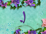
And finished, here is how it looks on my book, with a lil' bit of ribbon!
Later on, I will be adding a ton more stuff, but its good for a quick craft project this morning :)


So there you go - you can easily transform one object into something else!  You could paint them, glue fabric on them - pretty much anything!
So if you even spot some alphabets or something - really cheap - and they may not be what you want exactly, just remember - you can ALTER them!  
Have fun! 


- LEARN CRAFT IDEAS - 


29 April 2010

Beautiful day!   Hi stamper girlz!

Here's a glimpse into my world today as we took the dog out for a stroll - gorgeous blossoming trees in our nearby park!  My camera just can not do them justice....so pretty.


So my next pic is something inspired by the rich clusters of blossoms - and I will reveal it once its completed soon!  Stay tuned - I think it will be something I can use for Mother's Day!!


Happy crafting out there!

crafty hugs,
Beverly

26 April 2010

HAPPY BIRTHDAY DAUGHTER!!!

Happy Birthday hunny!  Whooo-hooo!  Another grand year ahead - and you've your whole life in front of you in which to have all your fabulous plans! Well, hope you had a lovely time - even though you had your last final exam on a Saturday which was also your birthday, lol - - and training for your new job for 5 hours the night before!!! Now relax - enjoy! oxox

 I can't believe it but my daughter has turned 22! Yikes where does the time go! I could say a million things about our life together but I won't in the interest of time and blogging, lol! Suffice to say that I am just happy to have a healthy, 22 yr old adult child - oh my, that sounds like an oxymoron doesn't it! Ha ha

Well, what I can say for sure is look how CUTE my card is standing among the giants beside it on the tv!


Honestly, this card was a bit tricky to make for the first time, but its so stinkin' cute, I wanna make more! 
I found the inspiration on the good ol' internet - and its using the TOP NOTE die and my BIG SHOT - but the trick is to just bite off the 'sides' of your folded cardstock! 

I will take some photos of how and insert them later on - because its hard to explain. But I think you can see the outline of the body and then across the head - is the same, right? Well, that's the TOP NOTE die, but just the 'edge' of the die - and you have to insert the die and paper sideways through the rollers so there is enough room because the cardstock is, for the most part, off to the side,of the die. Make sense - probably not, lol! But once you get it - no prob!

I made a half dozen 'temps before I got it right, and you could make a template, and then just hand-cut it too! 

Next, I made two creases 1/4 inch on either side of the center fold of the new shape, for the OWL to stand up......and not happy with just that, I made the STAND.  Just a length of paper folded at 2 spots, about 1 inch apart.  Here is the side view...

And then I rolled up a 'coupon ' for a free breakfast and stuck it inside the owl. My daughter thought it was his 'branch' ....which is a good idea, and I am going to play around with that idea on the next one! Thanks hun - two heads, better than one! 

Anyways, I presented it to her with her gift first thing in the morning, and we went off to the resturant for a 'birthday breakfast' which was inspired by the fact, that I wanted her to have a good, hearty breakfast before that stinkin' final exam! LOL - honestly, an exam on your birthday, on a Sat. Eh?

BUT - there's always a but, I had a SURPRISE PARTY for her on Sunday - aha! I made cake and we had a nice relaxing time, except for the one girl who still had one more exam to go. 

GO STUDENTS GO! 

We'd better get started on some GRADUATION CARDS next!!!! 

Happy Birthday.
24-04-1988 - my best day of all time! 
Love MOM

20 April 2010

Altered Objects II - Milk Crate

Hello-hello!

LOOK - another project around the home....this time, I re-dressed a milk carton!  I love it now!  In its "former" life, it was packaging for a set of scented home products from William Sonoma. And I loved it for awhile, but when I was finished with it (it had Christmas all over it!!) ...I thought it was too good to toss.  So I tucked it away for a rainy day.

Then in the first days of the weather turning warmer, I found it and decided it would be a nice addition to my kitchen or hallway. But in a new suit, so to speak.


TRACE THE ORIGINAL - CUT OUT A PATTERN
If you find something similar, in order to re-dress the surface, it's best to 'pick apart' the original.
a) Make a template.
And if you would like a template to make another, then this is the time to trace the whole thing - which I did - onto a large piece of poster card ($1 store!). Then I cut the template pattern out with scissors, and a hobby knife for interior slots.
b) Cut your new Cardstock /Paper
Using your new template, trace the outline onto the back side of the 12x12 in. cardstock/paper.  Do all sections.  Gently trace any interior sections that need to be cut out with a hobby knife - careful, to not tear your paper!
Now - you have your traced outline transferred to your cardstock/papers....cut away!
[ I always take my time on this step because I don't want my scissors to cut away too much....now its time to glue!]

RE-ASSEMBLE your original - because now its time to re-cover it.

ALTERING THE SURFACE
c) Re-cover the object

I use plain old white glue! (gasp!)  It's true, but you could use your own method - like adhesive spray - or even tape the entire outline [be careful to get all areas that might buckle if they are not secured down].
Anyways, I apply lines of white glue and then scrape it down (like washing the windows!) ...so I only leave a thin film of glue ...

...then line up the cardstock/paper to the old milk crate (your project) ...and working from the middle of each section, press and slide your hand to smooth out the cardstock/paper to the object's surface outward in all directions.  Starting in the middle assures that you will not slide the paper to one side, and helps to prevent buckles.   [Depending on your method, check to see how everything is working out in the first 5 mins. Sometimes, a piece is buckled up, so you should smooth it down ---a little coaxing! ]

d) Embellish
I used some lovely ribbon sent to me by a friend - such a nice green! Love the embroidered flowers!  And to really add a 'punch' - I used one of Stampin' Up!'s fabric flowers and a nifty silver brad!
VOILA!!!

Now by recycling, I have a nice beautiful, FRESH looking addition to my hallway. I used it to hold flowers for Easter.  I am waiting to recycle some frappachino bottles - the ones shaped like little milk bottles? They may hold some small embellishments - more storage! Won't that look great!

I am also working on matching coasters!  :)


SO GO AHEAD - RECYCLE SOMETHING!!!

- LEARN CRAFT IDEAS -

bye for now! 

Paint Chip inspires a Butterfly Card

Butterflies are always beautiful on cards - well, everything really.  So its no wonder I love our Big Shot's Bigz die Beautiful Butterflies.

This past week I have been working on a card where I received my inspiration from 2 places....a) a paint chip which had the colours burgandy, a gold, a peachy tone and a vanilla. I dug around my papers and came up with some Bravo Burgandy, Apricot Appeal and Very Vanilla. The peachy colour was also my second source for my inspiration .....b) a floral pick with butterflies.


So armed with that - I began to put my card together, with the Bravo Burgandy being the card base, and the Apricot Appeal (in  patterned prints) lending itself to becoming butterflies. A little embellishment went into the butterfly die cuts - I used matching Apricot Appeal chalk to darken the butterfly centers, and glittered the largest butterfly.

To add tactile interest, I crimped one of the smaller butterflies, and wrapped green ribbon around the card base to suggest the greenery of the butterflies's surroundings. Finally, I added an actual strip from the floral pick because I didn't have anything else that would be as nice!

Once I had the butterflies & ribbon attached - I had to move on to the important task of the greeting!

Since there was a large span of bare cardstock - I used tone-on-tone inking to create a 'word-scape' and chose these basic words that together suggest to the recipient that true values in life are still the basic ones: friends, nature, gratitude. To wrap it all together, my greeting says: "Count your Blessings". 

So there it is, a simple paint chip peeking at me from a corner pile of papers started it all - and a glance around my home to capture more ideas all brought me to this card's creation. You just never know where you're next inspiration will come!


Stampin' Up! Supplies: 
Punch - Scallop Corner punch; 
Cardstock - Bravo Burgandy, Apricot Appeal (retiring), Whisper White; 
Ink- VersaMark Marker(creates tone-on-tone effect);
 Other - Stampin' Pastels {Chalk}, Dazzling Diamonds Glitter, glue;
 Equipment - Big Shot Die-cutting Manual Machine, Bigz Beautiful Butterflies die; 
crimper


- LEARN HAND-MADE CARD IDEAS - 

18 April 2010

An Open Window Card

Hi ladies!
Let's honour our retiring Lavender Lace and Passion Pink cardstock!
Today's card is about trying out a new lay-out which I will simply call "Open Window"
From seeing a drugstore card, I tweaked around with the idea at home. 


Thee's one flower to each window but slightly off-set  
so that  both flowers become visible from the front of the card. 

 I chose a stem and even hand-wrote
part of one message using my markers.
Another point was to use the white gel pen to make stitching lines around a window...
.....the idea is to have fun!


Inside, one card I wanted to use a scrap piece of vellum with the following greeting...
but when I put the vellum up against the pink cardstock, I thought it looked
a little bland. Part of that is because the letters were very close
to the colour of the cardstock. As well, phantom words had 
been on the vellum in the background, and parts of those are visible
making it even more dicey.


My solution was to use a scrap of lighter coloured cardstock 
behind the vellum and then hightlight the "Wonderful" word.
To hightlight the word, I used pastel chalk, and created 
a small ribbon of hot pink chalk - see pic.


And here it is, pretty simple, huh?


Of course, I need my bling!
Bring out the gem brads to the rescue! 
I love to use gem brads in place of the 
letter 'o' all the time!


Now, its got a home on the inside which completes my sentiment....
"Because of you, its a Wonderful World"
My Happy Birthday was stamped on the opposite side. 
And a few more embellishing went on....


Basically, the same card in Lavender Lace. But I chose to
have more fun with glitter on this one.


Those glue pens work great for doing fine glitter work! 


Another thing, I like to tie in my handwritten notes to the card.
I use the stamps from the card, to stamp the paper I write on - 
nothing too crazy, just one corner works great! 
I think these are the things that make the recipient feel special -
its like getting candy on your pillow at the hotel, a small gesture
but works at making you feel nice :)


So there you have it.....so make someone feel nice by 
receiving a card from you - no reason needed, just a friendly hello!
CHEERS :)
Beverly


- LEARN HAND-MADE CARD IDEAS - 

16 April 2010

Box with Flower

If you happened to see the post below about sponging up embossed paper with ink - swiping the ink away to reveal the embossed pattern again, then you will recognize that I used this idea once more on my box lid!

In fact, that is how this box came to be!  I started inking and created 2 small squares of our Bridal Paper in white, re-inked to a pinky-red and a yellow.

Then I tripped over a small lid in my drawer. It has been there about a year!  It was made using our mini-scallop envelope, and I guess I got distracted and left it - or maybe I ran out of inspiration.

However - armed with the two pieces of scrap paper and a box lid - I had inspiration at last! The squares fit perfectly inside the box lid - and this all culminated in my creating this box. What I also think is nifty is the flower I stuck on top. That's an idea my daughter pointed out to me in a gift store - a small photo album had a fake flower on its cover. I was on a roll!  I decided to add beads - so with soft bead wire, I created the little beaded corners (this requires patience! but its not all that hard).

So with a few tweaks and a few twists, I finished my box and it is sitting in my china cabinet, now I just need an occasion to use it for - it would make a really nice gift box don't you think?

Thanks for dropping by!

Cheers!


Stampin' Up! Supplies
Cardstock - Crushed Curry, Bridal Specialty Paper (white), Soft Suede
Ink - Melon Mambo, Crushed Curry
Punch - 5-Petal Flower and Trio Flower and punches 
Equipment = The Big Shot, Scalloped Envelope Bigz Die,
Tabletop Cutter, Crop-a-Dile
Other - glue
Non-SU supply - rags, beads, wire, fabric flower, gem brad

- LEARN GREAT IDEAS LIKE THIS BY COMING TO A CLASS! - 

10 April 2010

Stampin' Up!'s NEW - COLOR RENOVATION coming in 2010-2011 Catalogue!

STAMPIN' UP! has announced changes to its colour line-up, with the previous Color Families being replaced with: BRIGHTS, SUBTLES, REGALS and NEUTRAL COLLECTIONS. 

 25 colours which will remain - 5 BRAND NEW colours are being added, and the IN COLORS will remain for a 2 year stay from this current lineup onwards, but will have a new line-up of In Colors every year as before. Therefore by 2012 there will be 10 In Colours present at any one time from that point forward.

So with the 40 CORE COLOR COLLECTION + 10 IN COLORs = 50 COLORS by 2011-2012.

The Core Collection has absorbed some of this year's In Colors to its line-up: Melon Mambo and Rich Razzleberry. And  returning previous In Color favourites: Baja Breeze, Pacific Point, Tangerine Tango, River Rock, Red Riding Hood and Pink Pirouette and Wild Wasabi.

That I personally am in love with - I use my River Rock, Wild Wasabi and Baja Breeze all the time! My Pink Pirouette and Pacific Point were lovingly being coddled in my collection - I was afraid to use the last of them up, lol! Now I can order more and whup it up!

YES - this means there will be adjustments made to all product containing colours such as Stampin Pastels, our Crayons, etc. I will post on those a bit later.

Confused?  I hope not - it will all make sense by the time the catalogues have made their way to you, and you see the new line-up of In Colors and we get craftin' like crazy with all the new stuff!  It's always a lovefest when the new cattys arrive, this year it will just be a bit more crazy!

I will post some more info as I go along. Stay tuned!

SAY GOODBYE!

However, many colours are not coming back....and you will need to look at your collection to see if those going make up a major part of your current craft projects - because YOU MAY WANT TO ORDER THEM BEFORE THEY ARE GONE!


Please contact me if you wish to order before the new changes arrive in summer.

Salute and Fond Farewell, in alphabetical order:
Almost Amethyst, Apricot Appeal, Ballet Blue, Barely Banana, Blush Blossom, Bordering Blue, Brilliant Blue, Brocade Blue, Cameo Coral, Close to Cocoa, Creamy Caramel, Gable Green, Glorious Green, Going Gray, Green Galore, Handsome Hunter, Lavender Lace, Lovely Lilac, Mellow Moss, Only Orange, Orchid Opulence, Pale Plum, Pink Passion, Pixie Pink, Really Rust, Ruby Red, Sage Shadow, Summer Sun, Taken with Teal, YoYo Yellow.

5 April 2010

APRIL STAMPIN' CLASS SCHEDULE

hELLO! fRIENDS!!!

It's crafty-dafty time again - class time, wheee!  
I love giving classes as much as I hope you enjoy doing them.


#1
APRIL STAMPING CLASS
SPECIAL STAMPING TECHNIQUES BOOKLET!  
Series I

Stamping and Organizing a Series of Stamping Techniques into a cute Mini-Booklet!
- 6 beautiful and functional techniques
  - a handy reference guide 
- an inspiration booklet
- cute and compact
-  Techniques Series II Class 
( to be announced at a later date) 
- great as a gift! 

also you will make a BONUS PROJECT! 


#2
APRIL SCRAPBOOK NIGHT CLASS
WHITE TONE-on-TONE SCRAPBOOK TECHNIQUE 
one night only 

This month we will be focusing on the many ways to use mono-tone, or Tone-On-Tone Techniques in your scrapbooking!  From Soft to Elegant to Subtle to Funky - there are SO MANY ways to use this technique to your advantage.  We will use WHITE as our base colour/ several  pages created. 


Available Class Times and Dates:
   
  April 15    Thursday  6:30 pm - Class #1 Stamping
  April 18     Sunday     1:00 pm - Class #1 Stamping
  April  23    Friday       6:30 pm - Class #2 Scrapbook Night.

Cost & Location -  
  My Craft Location - Ellesmere & McCowan Roads, Scarb.    
$25 per person -  RESERVE HERE
  Discounts available for the following:
           2for2 Discount = a $5 discount for each NEW Guest and yourself. 
FREE Class:
          for every $75 Stampin' Up! Order - free class for one, accumalative.

THANK YOU - SEE YOU THERE!

Beverly 


4 April 2010

Happy Easter

Happy Easter.

Has every one been enjoying their week-end?  It has been beautiful weather-wise which has made for a gorgeous backdrop to our enjoyment. Up early for Sunrise Service down by the lake - and then a breakfast of Hot Cross buns and jam, coffee and fruit. Simply nice start to the day here in our home. I hope it has been a lovely week-end for everyone!

And look what arrived in my mailbox!

A gracious friend, Sofia has sent along this adorable bunny card.  Thank you Sofia!


Goodnight :) 

"I always have a wonderful time, whereever I am, whomever I'm with."
Elmwood P. Dowd
movie ' Harvey '

1 April 2010

Stampin' Up! and Country Living Magazine " Cards à la Carte" and Projects

Cards a la Carte is one of our special promotions with COUNTRY LIVING Magazine, and like last year features a set that you can use for entertaining.  This year's is very pretty stationary set - elegantly sweet!


This exclusive kit (item 119113) includes the following products:

  • Dinner Party stamp set (set of 3)
  • Ballet Blue Classic Stampin' Spot
  • Preprinted stationery (24 sheets: 4 each of 6 designs)


Here is the collection and a couple of projects that you can do with it.


Project #1 is a Dinner Invitation

Stamps
Dinner Party stamp set*
Paper
Very Vanilla card stock
Very Vanilla envelope*
Ink
Ballet Blue Stampin' Spot*
Accessories
Stampin' Dimensionals


Instructions:


1. Print "You're invited" on Very Vanilla card stock and adhere to strip of Very Vanilla card stock. Wrap strip around So Saffron printed card from Country Living Cards à la Carte.

2. Stamp silverware image in Ballet Blue ink on Very Vanilla card stock. Cut out, distress one edge, then adhere to card stock strip using Stampin' Dimensionals.

3. Stamp silverware image in Ballet Blue ink on envelope flap.


Project #2   Mr. & Mrs. Card Collection


Stamps
Dinner Party stamp set*
Tiny  Tags stamp set**


Paper
Very Vanilla card stock
Very Vanilla envelope*


Ink
Ballet Blue Stampin' Spot*


Accessories
Linen thread
Very Vanilla 5/8" satin ribbon**
Stampin' Dimensionals
Medium Jewelry Tag punch**
1/16" Circle punch
1-3/4" Circle punch


Instructions:


1. Wrap Very Vanilla 5/8" satin ribbon around stack of Very Vanilla envelopes and printed cards from Country Living Cards à la Carte.


2. Stamp pitcher image in Ballet Blue ink on Very Vanilla card stock. Stamp flourish image in Ballet Blue ink in middle of pitcher. Punch out image using 1-3/4" Circle punch. Punch circle at top using 1/16" Circle punch. 

3. Stamp "Mr. & Mrs." in Ballet Blue ink on Very Vanilla card stock. Punch out using Medium Jewelry Tag punch. Punch hole in top of tag using 1/16" Circle punch. 


4. Thread linen thread through both Very Vanilla circle and tag. Tie around ribbon. Adhere tag to circle using Stampin' Dimensionals.


5. Stamp pitcher image in Ballet Blue ink on front of Very Vanilla envelope. Stamp flourish image in Ballet Blue ink on front of pitcher.

****

Cards  à la Carte  Stationary Kit Promotion - till April 30th, 2010. * Or till supplies last.


Template by: